Software
How Voice Changer Software Works: A Complete Informational Guide

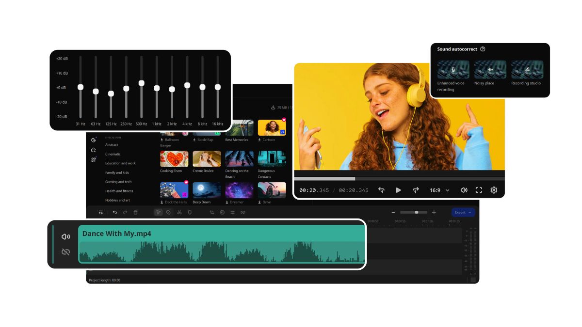
Voice technology has evolved rapidly over the past few years. What once felt like a simple tool for fun is now a powerful solution used in gaming, content creation, and even professional communication. Voice changers are no longer just about making your voice sound funny. They are now smarter, more realistic, and easier to use than ever before.
If you are curious about how these tools actually work, this guide will walk you through everything in a clear and natural way.
To understand how modern tools function in real situations, many users explore software like iTop Voicy as a practical example of today’s voice-changing technology.
What is a Voice Changer?
A voice changer is software that modifies the sound of your voice either in real time or after recording. It can adjust elements like pitch, tone, and texture to create a completely different sound.
For example, it can make your voice sound deeper, higher, or even like a different person altogether. Some tools can transform your voice into something creative, like a robotic tone or a character-style voice, while still keeping your speech clear and understandable.
How Does Voice Changing Technology Work?
At its core, voice changing relies on a combination of digital signal processing and artificial intelligence. While that may sound complex, the process itself is quite straightforward when broken down.
First, your microphone captures your voice as an audio signal. This is the raw input that the software will work with.
Next, the software processes that signal. During this stage, it analyzes your voice and adjusts different elements such as pitch and tone. This is where the transformation begins to take shape.
Modern tools also use artificial intelligence to improve the quality of the output. Instead of sounding robotic or unnatural, AI helps make the modified voice sound smoother and more realistic.
Finally, the processed voice is sent to the application you are using, such as a game, a communication app, or recording software. This all happens almost instantly, which is why real-time voice changers feel seamless.
Common Uses of Voice Changers
Voice changers are used in a variety of ways today, far beyond simple entertainment.
In gaming, players often use them to stay anonymous or to roleplay different characters. It can also add a fun and social element to multiplayer experiences.
Content creators use voice changers to make their videos more engaging. Whether it is storytelling, skits, or character voices, these tools allow for more creative expression.
In online communication, voice changers can add a layer of privacy or simply make conversations more enjoyable. Some people also use them for casual fun with friends.
Types of Voice Changers
Not all voice changers work in the same way, and understanding the different types can help you choose the right one.
Real-time voice changers modify your voice instantly while you are speaking. These are commonly used in gaming and live communication.
Pre-recorded voice editors are designed for editing audio after it has been recorded. These are useful for podcasts, videos, and voiceovers.
AI-based voice changers are more advanced and focus on creating realistic transformations. They often produce more natural results compared to basic tools.
Key Features to Look For
When exploring voice changer software, certain features can make a big difference in your experience.
A wide range of voice effects allows you to experiment and find the style that suits you best.
Customization options give you control over how your voice sounds, allowing you to adjust pitch, tone, and other elements.
Compatibility is also important. A good voice changer should work smoothly with popular apps and platforms.
Performance matters as well. Low latency ensures that your voice changes happen instantly without noticeable delay.
Advantages and Limitations
Voice changers offer several benefits, but they also come with a few limitations.
On the positive side, they enhance creativity and make it easier to experiment with different voice styles. They can also help protect your identity in online spaces. Most tools are easy to use, even for beginners.
On the other hand, some voice changers may slightly reduce audio clarity, especially if the settings are pushed too far. High-quality tools may also require a paid version to unlock their full potential. Overusing extreme effects can sometimes make the voice sound unnatural.
Is It Safe to Use Voice Changers?
In general, voice changers are safe when used responsibly. The most important thing is to download software from trusted sources and avoid unofficial versions.
Keeping your software updated and checking reviews before installing can also help you stay on the safe side.
Problems usually arise when users download modified or cracked versions, which may contain security risks. Being careful about where you download from can prevent most issues.
Tips for Better Voice Changing Results
If you want your voice to sound more natural and clear, a few simple adjustments can help.
Using a good microphone can significantly improve the final output. Clear input always leads to better results.
It is also important to adjust settings carefully. Small changes often produce more realistic results than extreme adjustments.
Reducing background noise can make a noticeable difference. A clean audio signal allows the software to process your voice more accurately.
The Future of Voice Changing Technology
Voice changing technology is still evolving, and the future looks promising. Tools are becoming more advanced, with better AI models that can produce highly realistic voices.
We are also starting to see integration with virtual environments, where voice transformation plays a role in digital identities. Real-time translation combined with voice changing is another area that is gaining attention.
Software like voice changer tools is already moving in this direction, blending artificial intelligence with real-time processing to create smoother and more natural experiences.
Conclusion
Voice changers have grown into powerful tools that go far beyond simple entertainment. They are now used in gaming, content creation, and everyday communication. Understanding how they work gives you a better idea of how to use them effectively.
Whether you are exploring them for fun or using them as part of your creative work, voice changers offer a unique way to express yourself. As the technology continues to improve, the possibilities will only expand further.
You May Also Read: YouTube MP3: The Complete Guide to Converting Videos to Audio Safely and Efficiently
Software
Backtofontshow: Complete Guide to Understanding, Using, and Exploring Digital Font Showcases
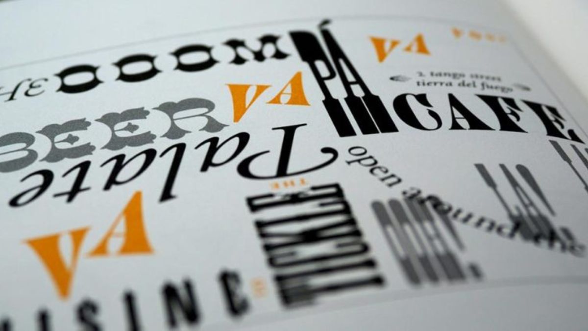
Typography plays a major role in modern design. Whether you are creating a website, building a brand identity, designing marketing materials, or publishing content online, fonts influence how people perceive your message. This is where backtofontshow becomes an interesting topic for designers, marketers, content creators, and typography enthusiasts.
As digital design continues to evolve, platforms, collections, and showcases dedicated to fonts help users discover new typefaces, compare styles, and make better design decisions. Understanding how backtofontshow fits into this ecosystem can help anyone improve their visual communication and design workflow.
What Is Backtofontshow?
Backtofontshow generally refers to a font showcase, presentation, or typography-focused resource that highlights different font styles, design trends, and creative applications.
In simple terms:
A font showcase is a curated collection of typefaces displayed to help users evaluate, compare, and select fonts for specific design purposes.
Font showcases are valuable because they allow designers to see how fonts perform in real-world situations before incorporating them into projects.
Why Font Showcases Matter
Typography affects:
- Readability
- User experience
- Brand identity
- Visual hierarchy
- Emotional perception
- Conversion rates
A well-chosen font can make content more engaging, while a poor choice can reduce clarity and professionalism.
The Growing Importance of Typography in Digital Design
Modern digital experiences rely heavily on typography. Websites, mobile applications, advertisements, and social media content all use fonts to communicate effectively.
Key Functions of Typography
| Typography Function | Impact on Users |
|---|---|
| Readability | Improves content consumption |
| Branding | Creates recognizable identity |
| Visual Hierarchy | Guides attention naturally |
| Accessibility | Enhances usability |
| Emotional Tone | Influences perception and mood |
Design professionals often spend significant time selecting fonts because typography directly influences audience engagement.
How Typography Shapes First Impressions
Studies in design consistently show that visitors form opinions about visual content within seconds. Font selection contributes to:
- Trustworthiness
- Professional appearance
- Brand consistency
- User retention
- Content credibility
This is why resources such as font showcases and typography galleries remain valuable.
How Backtofontshow Helps Designers
A typography showcase serves as more than a collection of fonts. It acts as a practical decision-making resource.
Discovering New Font Styles
Many designers become trapped using the same typefaces repeatedly. Font showcases encourage exploration by introducing:
- Modern fonts
- Experimental typography
- Vintage-inspired styles
- Minimalist fonts
- Luxury branding fonts
This exposure expands creative possibilities.
Comparing Fonts Side by Side
One major advantage is direct comparison.
Instead of downloading multiple typefaces individually, users can evaluate them in a single environment.
Benefits include:
- Faster selection
- Better project planning
- Improved consistency
- Reduced design revisions
Understanding Font Personalities
Every font communicates a unique personality.
For example:
| Font Category | Typical Personality | Common Use Cases |
|---|---|---|
| Serif | Traditional and trustworthy | Publishing, law firms |
| Sans Serif | Modern and clean | Websites, startups |
| Script | Elegant and personal | Invitations, luxury brands |
| Display | Creative and bold | Headlines, campaigns |
| Monospace | Technical and structured | Coding, technology |
Understanding these characteristics helps designers match fonts to project goals.
Popular Types of Fonts Featured in Showcases
Most typography collections organize fonts into categories.
Serif Fonts
Serif fonts include small decorative strokes at the ends of characters.
Advantages:
- Professional appearance
- Strong readability
- Traditional feel
Common examples include classic publishing and editorial styles.
Sans Serif Fonts
Sans serif fonts remove decorative strokes and emphasize simplicity.
Benefits:
- Clean appearance
- Modern aesthetic
- Excellent digital readability
Many technology brands rely heavily on sans serif typography.
Script Fonts
Script fonts mimic handwriting and calligraphy.
Best used for:
- Invitations
- Luxury branding
- Personal projects
- Creative marketing
However, excessive use can reduce readability.
Display Fonts
Display fonts are designed for attention-grabbing headlines.
Characteristics:
- Highly decorative
- Unique styling
- Strong visual impact
They work best in limited amounts.
How to Choose the Right Font
Selecting typography requires strategic thinking.
Define the Project Goal
Before choosing a font, identify:
- Target audience
- Brand personality
- Content type
- Platform requirements
The same font rarely works equally well across every project.
Prioritize Readability
Readability should always come first.
Ask yourself:
- Is the font easy to scan?
- Does it work on mobile devices?
- Is it accessible for diverse audiences?
Beautiful typography loses value if users struggle to read it.
Test Multiple Variations
A font may look different depending on:
- Size
- Weight
- Screen resolution
- Background color
- Device type
Testing ensures consistent performance.
Best Practices for Using Typography Effectively
Create Clear Hierarchy
Typography should guide readers naturally through content.
Use:
- Large headings
- Medium subheadings
- Readable body text
Consistency improves user experience.
Limit Font Families
Too many fonts create visual confusion.
Most projects perform well with:
- One heading font
- One body font
- Optional accent font
Maintain Consistent Spacing
Typography is not only about letters.
Proper spacing improves:
- Readability
- Visual balance
- Professional appearance
Consider Accessibility
Accessible typography benefits all users.
Recommended practices include:
- Adequate contrast
- Readable font sizes
- Clear letterforms
- Responsive design
Common Mistakes When Exploring Font Showcases
Many beginners focus only on appearance.
Choosing Style Over Function
A decorative font may look impressive but fail in practical applications.
Always evaluate usability first.
Ignoring Brand Consistency
Changing fonts frequently weakens visual identity.
Strong brands maintain consistent typography systems.
Using Too Many Fonts
Excessive font combinations create clutter.
Stick to a structured typography framework.
Neglecting Mobile Optimization
Fonts that appear excellent on desktops may perform poorly on smaller screens.
Always test across devices.
Backtofontshow and Modern Branding
Branding depends heavily on typography.
Companies use fonts to communicate:
- Authority
- Innovation
- Luxury
- Creativity
- Reliability
A font showcase helps organizations identify styles aligned with their messaging goals.
Typography’s Role in Brand Recognition
Think about major brands.
Many are recognizable partly because of their typography choices.
Consistent font usage contributes to:
- Visual memory
- Brand trust
- Market differentiation
Pros and Cons of Using Font Showcases
Pros
- Faster font discovery
- Better comparison opportunities
- Increased design inspiration
- Improved typography knowledge
- More efficient project planning
Cons
- Too many choices can overwhelm beginners
- Trend-focused selections may age quickly
- Visual previews may differ from real-world implementation
- Some showcased fonts may require licensing fees
Practical Example of Font Selection
Imagine a startup launching a technology website.
Recommended approach:
| Design Element | Suggested Font Style | Reason |
|---|---|---|
| Logo | Modern Sans Serif | Clean and innovative |
| Headlines | Bold Sans Serif | Strong visual impact |
| Body Content | Readable Sans Serif | Better user experience |
| Call-to-Action | Semi-Bold Font Weight | Increased visibility |
This structured approach creates consistency while maintaining readability.
Future Trends in Typography Showcases
Typography continues to evolve.
Emerging trends include:
- Variable fonts
- Responsive typography
- Minimalist design systems
- AI-assisted font recommendations
- Accessibility-first type design
- Experimental digital typography
As these trends grow, font showcase platforms will become increasingly valuable for staying current.
Conclusion
Backtofontshow represents the growing importance of typography discovery, comparison, and creative exploration in modern design. Whether you are a professional designer, business owner, marketer, or content creator, understanding how font showcases work can improve both visual communication and user experience.
The most effective typography combines aesthetics with functionality. By focusing on readability, consistency, accessibility, and brand alignment, you can make better design decisions and create stronger visual identities. Font showcases provide the inspiration and evaluation tools needed to navigate the ever-expanding world of typography with confidence.
SEO FAQs
1. What is backtofontshow?
Backtofontshow refers to a font showcase or typography-focused resource that helps users discover, compare, and evaluate different font styles.
2. Why are font showcases useful?
They allow designers to compare fonts efficiently, explore new typography trends, and make informed design decisions.
3. How do I choose the right font?
Consider readability, audience, brand personality, project goals, and platform requirements before selecting a font.
4. What are the main font categories?
The primary categories include serif, sans serif, script, display, and monospace fonts.
5. Can typography affect branding?
Yes. Typography strongly influences brand recognition, professionalism, trust, and overall user perception.
/ You May Also Read /
Freaky Font: What It Is, How to Use It, and the Best Ways to Create Stylish Text Online
Fontlu Explained: A Complete Guide to Understanding and Using Fontlu Effectively
Introduction
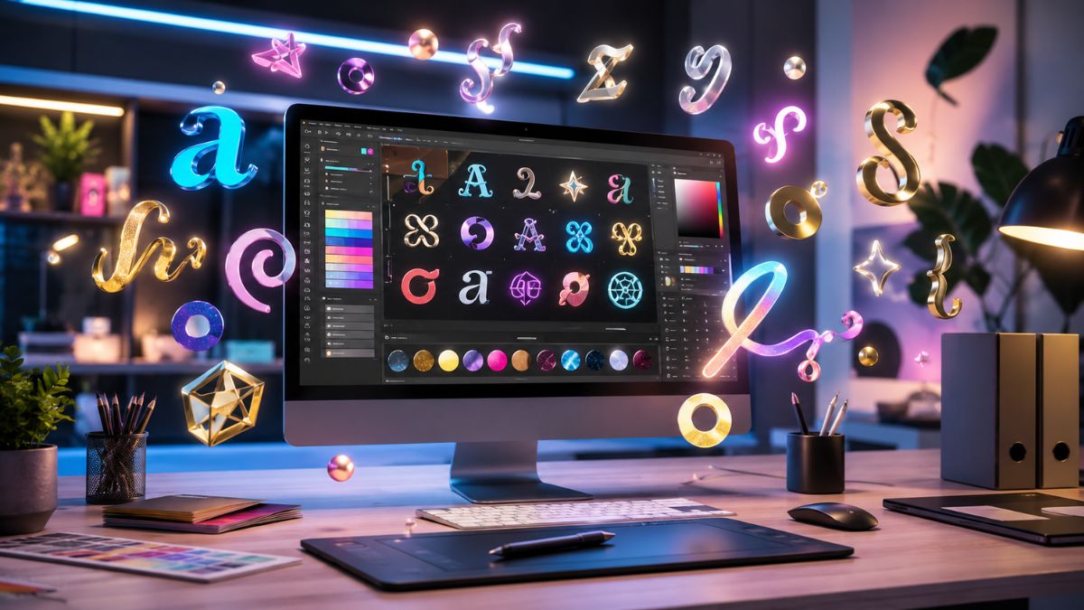
A freaky font has become one of the most popular ways to make online text stand out. Whether you’re creating a social media bio, customizing a username, designing a gaming profile, or adding personality to messages, stylish text can instantly attract attention.
Unlike traditional fonts installed on a device, many freaky text styles are created using special Unicode characters that look unique across different platforms. This allows users to copy and paste eye-catching text almost anywhere online.
In this guide, you’ll learn what a freaky font is, how it works, where to use it, common mistakes to avoid, and the best practices for creating readable and attractive text.
What Is a Freaky Font?
A freaky font refers to decorative, unusual, or stylized text that looks different from standard lettering. These styles often use special Unicode symbols, accented characters, mathematical alphabets, and decorative typography variations.
Quick Definition
A freaky font is a stylized text format that transforms ordinary letters into decorative or unusual-looking characters for creative online use.
Many people use these text styles to make their content more noticeable on social media platforms, gaming communities, messaging apps, and digital profiles.
Why Are They Popular?
Several factors contribute to their popularity:
- They grab attention quickly.
- They make profiles look unique.
- They help create a personal brand.
- They add creativity to online content.
- They improve visual appeal in captions and usernames.
How Freaky Fonts Work
Most people assume these styles are actual fonts. In reality, many online text generators convert regular letters into Unicode symbols that resemble different typography styles.
For example:
| Standard Text | Stylized Variation |
|---|---|
| Hello | |
| Design | |
| Creative | |
| Stylish |
Because these characters are part of Unicode, they can often be copied and pasted across multiple platforms without requiring font installation.
Unicode vs Traditional Fonts
| Feature | Unicode Text Styles | Traditional Fonts |
|---|---|---|
| Installation Required | No | Yes |
| Copy and Paste Friendly | Yes | Limited |
| Social Media Compatible | Often | Depends |
| Device Support | High | Varies |
| Easy Sharing | Excellent | Moderate |
This flexibility explains why stylish text generators have become so popular.
Popular Uses of Freaky Fonts
People use decorative text in many different ways online.
Social Media Profiles
Unique typography helps profiles stand out among thousands of others.
Examples include:
- Instagram bios
- TikTok usernames
- Facebook profiles
- X (Twitter) display names
- YouTube channel descriptions
Gaming Usernames
Gamers frequently use stylized characters to create memorable names.
Benefits include:
- Distinct identity
- Better recognition
- Creative branding
- Enhanced profile appearance
Messaging and Chat Apps
Decorative text can make messages more engaging.
Common applications:
- Special announcements
- Group chat names
- Event invitations
- Personalized greetings
Content Creation
Content creators often use stylish typography in:
- Video titles
- Graphic designs
- Community posts
- Digital branding
Different Types of Freaky Font Styles
Not all stylish text looks the same. Some styles focus on elegance while others emphasize creativity.
Script Fonts
Script styles imitate handwriting and cursive lettering.
Characteristics:
- Elegant appearance
- Flowing letters
- Decorative design
Example:
Bold Decorative Styles
These fonts create strong visual impact.
Ideal for:
- Headlines
- Usernames
- Short phrases
Example:
Gothic Styles
Gothic-inspired typography creates a dramatic appearance.
Popular among:
- Gaming communities
- Creative profiles
- Alternative aesthetics
Example:
Bubble Text
Bubble-style characters appear playful and fun.
Suitable for:
- Casual profiles
- Friendly branding
- Social content
Minimalist Styles
These variations offer subtle customization while maintaining readability.
Best for:
- Professional profiles
- Business branding
- Personal websites
Benefits of Using a Freaky Font
When used correctly, decorative text offers several advantages.
| Benefit | Why It Matters |
|---|---|
| Higher Visibility | Helps content stand out |
| Unique Identity | Creates memorable profiles |
| Improved Branding | Supports personal branding |
| Creative Expression | Adds personality to text |
| Better Engagement | Encourages user attention |
Enhanced Personal Branding
Consistent typography can strengthen an online identity and make content instantly recognizable.
Better Visual Appeal
Stylized text creates contrast that draws readers toward important information.
Creative Freedom
Users can experiment with different looks until they find a style that matches their personality.
Pros and Cons of Freaky Fonts
Pros
- Easy to create
- No software installation required
- Great for social media
- Supports personal branding
- Available in many styles
- Works on most devices
Cons
- Can reduce readability
- Not ideal for long content
- Some characters may not display correctly everywhere
- Excessive use can look unprofessional
- Accessibility may be affected
Common Mistakes People Make
Many users overuse decorative typography, which can reduce its effectiveness.
Using It Everywhere
Stylized text works best when used strategically.
Avoid transforming:
- Entire articles
- Long captions
- Important instructions
- Professional documents
Ignoring Readability
If readers struggle to understand the text, the design loses its purpose.
Mixing Too Many Styles
Combining multiple decorative formats often creates visual clutter.
For example:
- Script + Gothic + Bubble + Symbols
- Excessive emojis
- Random character substitutions
Choosing Style Over Function
Always prioritize communication before decoration.
Best Practices for Using Freaky Fonts
Keep It Short
Stylized text performs best in:
- Names
- Titles
- Headers
- Short quotes
Maintain Readability
Ask yourself:
“Can someone understand this instantly?”
If not, choose a simpler style.
Stay Consistent
Use one typography style across:
- Bios
- Usernames
- Brand assets
- Community profiles
Consistency improves recognition.
Test Across Platforms
Different apps display Unicode characters differently.
Before finalizing:
- Check mobile devices
- Test desktop displays
- Verify social media compatibility
Use Decorative Text Sparingly
A small amount often creates more impact than excessive styling.
How to Choose the Right Style
The best style depends on your goals.
| Goal | Recommended Style |
|---|---|
| Professional Branding | Minimalist |
| Creative Portfolio | Script |
| Gaming Profile | Gothic |
| Social Media Bio | Decorative Bold |
| Casual Messaging | Bubble Text |
Consider your audience before selecting a style.
Questions to Ask
- Is the text easy to read?
- Does it match my personality?
- Will my audience understand it?
- Does it support my branding?
These questions help prevent poor typography choices.
The Future of Decorative Typography
Online communication continues to evolve. As personalization becomes increasingly important, creative text styles will likely remain popular.
Users consistently seek new ways to stand out in crowded digital environments. Decorative Unicode text provides a simple and accessible solution without requiring advanced design skills.
However, readability and accessibility will continue to influence how these styles are used. The most effective approach combines creativity with clarity.
Conclusion
A freaky font can transform ordinary text into something memorable and visually engaging. Whether you’re enhancing a social media profile, creating a unique gaming identity, or strengthening personal branding, decorative typography offers countless creative possibilities.
The key is balance. Use stylish text to highlight important elements rather than overwhelming readers. Focus on readability, consistency, and platform compatibility. When used thoughtfully, these unique text styles can help your content stand out while maintaining a professional and attractive appearance.
Frequently Asked Questions
1. What is a freaky font?
A freaky font is a stylized text format that uses decorative Unicode characters to create unique-looking text.
2. Are freaky fonts real fonts?
Many are actually Unicode character variations rather than installed font files.
3. Can I use freaky fonts on social media?
Yes. Most social media platforms support many Unicode-based text styles.
4. Do freaky fonts work on mobile devices?
In most cases, yes. However, appearance can vary depending on the device and platform.
5. Are decorative fonts good for professional branding?
They can be useful when applied carefully, but readability should always remain a priority.
/You May Also Read/
Understanding SOA OS23: Architecture, Benefits, Implementation Strategies, and Real-World Use Cases
Software
How to Leverage content://cz.mobilesoft.appblock.fileprovider/cache/blank.html for Enhanced Productivity

Introduction
The concept of digital productivity has evolved rapidly with the rise of mobile tools designed to limit distractions and improve focus. One unusual yet interesting element that often appears in technical environments is content://cz.mobilesoft.appblock.fileprovider/cache/blank.html, which is commonly associated with AppBlock’s internal system handling blank or blocked pages. While it may look like a technical file path, understanding how such mechanisms relate to focus tools can help you build stronger digital habits and improve productivity.
At its core, content://cz.mobilesoft.appblock.fileprovider/cache/blank.html represents how modern apps redirect or block distracting content, replacing it with a neutral or blank page to keep users focused. In this article, we will explore how this concept can be leveraged for enhanced productivity, smarter focus management, and better digital discipline.
Understanding content://cz.mobilesoft.appblock.fileprovider/cache/blank.html in Productivity Systems
What It Actually Represents
The string content://cz.mobilesoft.appblock.fileprovider/cache/blank.html is part of an Android-based content URI system. It is typically used internally by applications like AppBlock to display a blank page when access to a blocked app or website is restricted.
Instead of letting distractions appear, the system redirects users to a neutral state—effectively breaking the habit loop of distraction.
Why It Matters for Focus
This mechanism is more than just a technical path. It symbolizes a productivity principle:
- Replace distractions with neutral space
- Interrupt impulsive behavior patterns
- Encourage intentional device usage
- Reduce cognitive overload
How content://cz.mobilesoft.appblock.fileprovider/cache/blank.html Supports Digital Focus
When integrated into productivity systems, this type of redirect mechanism becomes a powerful behavioral tool.
Key Productivity Benefits
- Blocks attention-draining apps
- Creates friction before distraction
- Reinforces focus habits
- Supports deep work sessions
- Reduces dopamine-triggering interruptions
Productivity Impact Breakdown Table
| Feature | Productivity Effect | User Benefit |
|---|---|---|
| Blank page redirect | Interrupts distraction cycle | Improved focus retention |
| App blocking system | Prevents access to addictive apps | Better time control |
| Scheduled restrictions | Automates discipline | Consistent productivity |
| Custom rules | Personalized control | Flexible workflow design |
How to Leverage content://cz.mobilesoft.appblock.fileprovider/cache/blank.html for Enhanced Productivity
1. Turn Digital Blocks into Focus Triggers
Instead of viewing blank redirects as interruptions, use them as cues to redirect attention.
For example:
- Social media blocked → start reading notes
- Entertainment app blocked → begin work task
- Browsing restricted → switch to planning mode
2. Build a Focus-First Workflow System
A structured workflow improves consistency and reduces decision fatigue.
Example Workflow Strategy
| Time Block | Activity | App State |
|---|---|---|
| Morning Deep Work | Writing / studying | All distractions blocked |
| Midday Tasks | Emails / communication | Limited app access |
| Evening Review | Planning & reflection | Relaxed restrictions |
This structure helps your brain associate blank or blocked states with productive transitions.
3. Use “Blank State Reinforcement” Technique
Every time content is blocked and replaced with a blank page, your brain receives a signal: “Not now.”
Over time, this creates:
- Reduced impulsive checking
- Stronger attention control
- Better habit conditioning
Comparison of Productivity Tools Using Block Systems
Different apps offer different approaches to distraction control.
Productivity Tools Comparison Table
| Tool Type | Strength | Weakness |
|---|---|---|
| App blockers | Strong restriction control | Can feel rigid |
| Focus timers | Encourages structured work | Easy to ignore |
| Website blockers | Great for desktop use | Limited mobile control |
| Full digital wellness suites | Comprehensive tracking | Requires setup time |
Practical Use Cases for Better Productivity
Students
- Block entertainment apps during study hours
- Replace distractions with blank screens
- Improve exam preparation focus
Professionals
- Reduce notification overload during deep work
- Prevent social media checking during work blocks
- Increase task completion speed
Freelancers
- Maintain discipline without supervision
- Separate work time from leisure time
- Avoid multitasking distractions
Pros and Cons of Using Blank Redirect Systems
Pros
- Strengthens attention control
- Reduces screen addiction
- Encourages structured habits
- Improves time awareness
Cons
- Initial resistance to restrictions
- Possible over-blocking of useful apps
- Requires consistent setup discipline
Common Mistakes When Using App Blocking Systems
- Overblocking essential apps
- Not setting clear schedules
- Ignoring gradual habit building
- Relying only on tools without self-discipline
- Frequently bypassing restrictions
Avoiding these mistakes ensures long-term productivity improvements.
Best Practices for Maximum Productivity
- Start with light restrictions and increase gradually
- Combine blocking tools with time management techniques
- Review weekly usage patterns
- Align blocks with real goals
- Use blank redirects as mindfulness cues
Advanced Productivity Strategy Framework
To maximize effectiveness, combine multiple strategies into a single system:
Focus Stack Model
| Layer | Purpose |
|---|---|
| Blocking layer | Removes distractions |
| Scheduling layer | Organizes time |
| Awareness layer | Tracks behavior |
| Reflection layer | Improves habits |
When used together, these layers create a sustainable productivity environment.
Psychological Insight Behind Blank Redirects
The effectiveness of systems like content://cz.mobilesoft.appblock.fileprovider/cache/blank.html is rooted in behavioral psychology.
- Cue interruption: Breaks automatic behavior
- Reward delay: Reduces instant gratification
- Cognitive reset: Forces attention shift
- Habit replacement: Encourages new routines
This is why even a simple blank page can significantly improve focus over time.
Conclusion
Modern productivity is not just about working harder—it is about controlling attention. Mechanisms like content://cz.mobilesoft.appblock.fileprovider/cache/blank.html demonstrate how digital systems can help users interrupt distractions and build stronger focus habits.
By using app blocking intelligently, creating structured workflows, and understanding behavioral triggers, you can transform your device into a productivity tool instead of a distraction source.
Frequently Asked Questions
1. What is content://cz.mobilesoft.appblock.fileprovider/cache/blank.html used for?
It is typically used by app-blocking systems to display a blank page when access to restricted content is blocked.
2. Can blank page redirects improve productivity?
Yes, they help interrupt distractions and encourage users to refocus on productive tasks.
3. Is AppBlock effective for focus improvement?
Yes, when used consistently, it helps reduce distractions and build better digital habits.
4. Should I block all apps for productivity?
No, only block distracting apps. Overblocking can reduce flexibility and productivity.
5. How do I build better focus habits?
Combine app blocking, time scheduling, and intentional work sessions for best results.
/ You May Also Read /
Understanding SOA OS23: Architecture, Benefits, Implementation Strategies, and Real-World Use Cases
YouTube MP3: The Complete Guide to Converting Videos to Audio Safely and Efficiently
-

 Business3 months ago
Image Search Techniques: Smarter Ways to Find Accurate Visual Results Online
-

 Health2 months ago
Pravi Celer: Benefits, Uses, and How to Add It to Your Daily Diet
-

 Business3 months ago
Understanding the Idaho Policy Institute Formal Eviction Rate 2020 Shoshone County: Housing Stability Insights
-

 Technology2 months ago
Messagenal Explained: Features, Benefits, and How to Use It Effectively
-

 Sports2 months ago
AC Milan vs SSC Bari Timeline: Complete History, Key Matches, and Rivalry Moments
-

 Technology5 months ago
Top Features of ProgramGeeks Social You Didn’t Know About
-

 Business3 months ago
Unlocking Business Potential: How Pedrovazpaulo Operations Consulting Transforms Organizations
-

 Technology2 months ago
TabooTube: What It Is, How It Works, and Whether It’s Worth Your Time